|
 e
read a page of English and most other European languages from left to right
and top to bottom. That simple fact creates a progression in reading from
the upper left to the lower right. If you arrange information on a page
to match this progression, the page feels comfortable and logical. e
read a page of English and most other European languages from left to right
and top to bottom. That simple fact creates a progression in reading from
the upper left to the lower right. If you arrange information on a page
to match this progression, the page feels comfortable and logical. |
|
 |
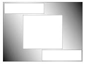
The best areas for information are
within the pattern of progression, the lighter areas in the diagram. The
corners at the upper right and lower left, which fall outside the pattern,
are not good locations for essential information or anything that will
distract the reader from the essential information. |
|
 |
Limiting text to a narrow column makes the
readers job easier because long lines of text are difficult for the eye
to follow. Breaking the text into short paragraphs of closely related information
imposes a logical pattern on the written expression of ideas and a visual
pattern on the presentation of the writing. |
|
|
If we begin with the readers pattern of progression
through a page, exclude the corners outside the pattern, and limit the
body text to a column narrow enough for easy reading, we arrive at a framework
for a page that guides the reader along a comfortable path from entry at
the top left through exit at the lower right. To keep the reader from being
distracted from the text, all instructions, explanations, anecdotes, and
links should appear within the areas shown in white in the diagram at the
right. The gray areas should be used for illustrations, diagrams, and photographs
that will enhance the readerís understanding of the text. |
 |
|
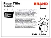
Youll put the entry area of the
page to best use if you identify the page with a navigational header, descriptive
title, and subtitle and provide a few sentences that summarize or introduce
the content of the page. In the exit area, you might reiterate the most
important point or main idea of the page. Links to other areas of the site,
to related pages, or to pages that follow in sequence should be the last
cluster of information the reader encounters before leaving the page. They
are the exit portals. The upper right hand corner is a good spot for your
brand or logo. Note that images should when possible be placed within the
path as it flows from top left to bottom right. |
 |
|
|
|
|
This basic pattern
provides a framework for making information flow logically for readers
of Western languages. At times you will want to break the patternadding
a sidebar, for examplebut avoid distractions that diminish understanding. |
KRAFT
& KRAFT HOME
SERVICES
WEB
CONTENT PRODUCTION
VIDEO
PRODUCTION
INTERACTIVE
INSTRUCTION
TEXTBOOKS
GENERAL
BOOKS
HINTS
& TIPS
ERIC
KRAFT |